

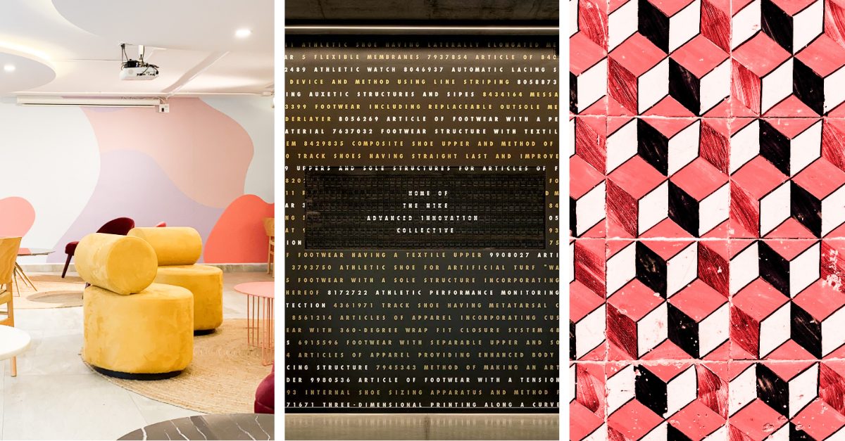
What if your office was the first thing clients remembered about you?
This simple question can challenge how any leader thinks about their workspace design.
After a prolonged period of employees working remotely, the office has become more than a functional necessity. It’s a powerful storytelling platform that shapes perception, trust, and ultimately business outcomes.
Visual Identity Design: How Leading Companies Are Designing Around Brand Stories
Recently, the buzz in our office was the stunning Otter Air Service HQ design by OTJ Architects. What struck us was how they translated Otter’s brand values—balancing luxury and hospitality—into a modern, clean, and welcoming space with a Split Flap display at the center. This isn’t just interior design, we thought, it’s branding at its best.

In this long-form article, we’ll discuss brands that capture the essence of their identity through intentional design. The framework concluding the piece is positioned to help inspire brands undergoing an office redesign.
The Rise of Hybrid, Multi-Use, and Sensory Spaces
As hybrid work becomes the norm, offices like Otter Air Services are being reimagined as collaboration hubs and cultural anchors. The 2025 design landscape, rather than following the typical office design blueprint, prioritizes multi-sensory, branded environments that support varied work modes and foster identity—which is important for both full-time, in-person and visiting staff who are on-site less frequently.
The impact of this intentional design is measurable. After redesigns, some companies have seen office occupancy nearly double as spaces become more inviting and functional.
- Data from VergeSense’s Q3 2021 Hybrid Work Insights shows that the utilization of collaborative spaces has increased by 50%.
- HP’s new workplace saw a significant rise in occupancy throughout the workweek, exceeding 30% on weekdays.
- Deng reports that when his company redesigned its own office based on usage data, it notched a 200% increase in voluntary office attendance.
Moreover, 75% of organizations are actively investing in AI and data to enhance the in-office experience, signaling that investing in design and tech isn’t just about aesthetics—it’s a strategic business decision.
Building a Space That Tells Your Story
Your office is more than a place to work—it’s a physical manifestation of your identity. The most memorable brands are those that seamlessly integrate design, culture, and values into every square foot.
So, ask yourself: what story is your space telling? And more importantly, is it the story you want your clients and team to remember?
Here are five examples of different office spaces that show what it means to translate a brand story into an office design that works — as well as a framework to put your own office redesign into motion.
Brand Examples
Lebron James Innovation Center (Nike), Beaverton, Oregon
LeBron James is a prime example of an athlete who has unlocked human potential through relentless determination and sport. His achievements reflect the brand story of Nike itself, which is rooted in championing athletes through community and equality. The partnership between the two is perfect, resulting in The LeBron James Innovation Center at one of the Nike headquarters in Beaverton, Oregon.
The images below (Instagram, Nike, Nice Kicks), are a few photographs from their space.

Nike: Brand Identity Breakdown
- Tone: Bold, motivational, aspirational, and culturally resonant
- Colors: Black, white, Nike Orange, metallic silver
- Visual Style: Strong, clean typography; high-contrast photography; bold use of black/white with brand color pops; cinematic and emotionally charged imagery
- Brand Symbols: Swoosh logo, athlete endorsements
- Positioning: A global lifestyle and performance leader that speaks to every athlete
- Storytelling Focus: Athlete journeys, breaking barriers, social impact, and product innovation
Nike’s Beaverton headquarters is a living embodiment of their signature tone. Built for the optimization of performance, the space includes a full-size basketball court, as well as statement art such as their visual patent wall (with an Oat Foundry split flap display at the center), and an abstract mural centered around LeBron.
Takeaway: Architecture Magazine wrote about how a workspace should become a physical manifestation of a client’s brand tone, noting the opportunity in designing a space for a “business to live what it believes.” For Nike, that tone is bold, driven, and uncompromising—rooted in movement, determination, and breaking limits.

Nike interior moodboard using images from their facility (Instagram, Nike, Nice Kicks) and photographs/elements from Canva Pro.
[solidcore], Arlington, VA
[solidcore], like Nike, lives and breathes an athletic, active lifestyle—but its story drills deeper into personal transformation. Built around an intense, Pilates-inspired workout, the brand’s narrative is about guiding individuals to discover their strongest selves, both physically and mentally. Since Anne Mahlum founded the company in 2013, [solidcore] has grown into a movement—one defined by grit, community, and measurable progress.
The images below of [solidcore]’s interior (Office Snapshots, [solidcore]) show some of the most innovative and exciting components in their space.

[solidcore]: Brand Identity Breakdown
- Tone: Intense, personal, and empowering with a sense of exclusivity
- Colors: Electric blues and blacks
- Visual Style: Dark, moody studio lighting; sharp, modern typography; close-up, sweat-drenched authenticity
- Brand Symbols: Resistance machines, dim-lit studio environment, emphasis on form and endurance
- Positioning: A boutique, high-performance fitness experience that challenges both body and mind
- Storytelling Focus: Physical and mental transformation, community grit, and measurable progress over time
When designing their new HQ, [solidcore] carried this story into every square foot—mirroring the intimate, goal-driven atmosphere of their studios. The challenge wasn’t just about creating a functional workspace; it was about choreographing an experience. The environment speaks the brand’s language through moody lighting and purposeful layouts, with thoughtful touches such as a split-flap display aside a custom-made Pilates sign.
“It was important to ensure the space felt lively and active regardless of the quantity of staff on-site at any given point in time,” Lou Benedetto, Director of Design said in an interview on the [solidcore] website.
Takeaway: Think of your space as a living chapter in your brand’s story and map the visitor’s journey—what they see, hear, and feel at every step—and use those moments to build trust, convey purpose, and immerse them in your narrative.

The moodboard of [solidcore]’s interior (Office Snapshots, [solidcore]) expresses their fun and fit energy, also using elements from Canva Pro.
BBC Studios, Manchester, UK
BBC Studios aims to “Inform, Educate, Entertain – Globally”—a promise it delivers through world-class programming rooted in British heritage. As a leading global content company, BBC Studios positions itself at the intersection of cultural authority and creative play, producing and distributing narratives that resonate with audiences all over the world.
The images below are of BBC Studios interior (Glassdoor, BBC Studios) and show their expansive, collaborative space.

BBC Studios: Brand Identity Breakdown
- Tone: Intelligent, engaging, authoritative yet accessible; confident while embracing creative playfulness
- Colors: Fuchsia, greens, black and white, greys
- Visual Style: Clean, modern design anchored by motif that symbolizes energy and collaboration; bold color blocks and high-quality imagery that showcase diverse content
- Brand Symbols: BBC logo, atomic dot animations, imagery from iconic BBC programs
- Positioning: A leading global content company with commercial innovation to create, distribute, and celebrate world-class programming
- Storytelling Focus: Authentic, high-quality narratives that inform, inspire, and entertain—spanning drama, documentary, comedy, natural history, and beyond
Their Manchester headquarters reinforces this positioning with a bold, playful celebration of color, geometry, and thematic zoning. Vibrant greens, bursts of purple, and crisp black-and-white patterns convey the brand’s energy, while an open atrium layout fosters visibility and connection across floors. Sculptural furniture pieces serve as both functional work zones and visual statements, with semi-enclosed pods providing privacy without breaking the flow.
Takeaway: Space is a reflection of market position. For BBC Studios, blending high-energy collaboration areas with private, focused zones supports both their creative agility and their operational excellence—ensuring the environment can adapt alongside the brand’s global leadership.

The images included in the BBC Studios interior moodboard (Glassdoor, BBC Studios), combined with Canva Pro elements, show the fast-paced nature of their space.
Artica Oy, Helsinki, Finland
Artica Shipping of Finland has long been a dependable guardian of maritime mobility in the harsh Arctic, a role reflected in the rugged yet refined aesthetic of its brand.
The images below of Artica Oy’s exterior (NordTreat, ArchDaily) leverages the setting sun to demonstrate the intentional design of its space, reflecting against the water for more depth.

Artica Oy: Brand Identity Breakdown
- Tone: Authoritative and resilient, with a quiet confidence rooted in expertise and public trust
- Colors: Maritime blues, greys inspired by ice
- Visual Style: Rugged yet refined—bold typography, deep blues or dark neutrals, and imagery that highlights icebreakers and icy seascapes. Industrial elegance through clean lines and direct, functional aesthetics
- Brand Symbols: Icebreakers themselves are central icons; design cues draw from maritime heritage—steel, industrial textures, and nautical typologies
- Positioning: Finland’s leading maritime operator, offering essential icebreaking, hydrographic surveying, and fairway maintenance services, combining public-sector responsibility with operational excellence
- Storytelling Focus: Emphasizes national resilience, behind-the-scenes maritime labor, seasonal reliability, and technological innovation woven into a narrative of continuity and security
The minimalist floating HQ translates this visual style into architectural form. Expansive floor-to-ceiling glazing mirrors the horizon, while honey-toned timber cladding softens the industrial edge and radiates craftsmanship. Slate-like dark stone accents ground the structure, and the reflective water surface animates the façade with constant movement. Clean lines, symmetry, and a carefully composed entry sequence invite visitors into a space that balances function and elegance.

The images of Artica Oy’s exterior (NordTreat, ArchDaily), combined with maritime elements from CanvaPro, show off its nautical palette.
Skyscanner HQ, Edinburgh, Scotland
Skyscanner, intended to be an “ally” for all travelers, simplifies the complexity of trip planning by vowing to offer transparent, unbiased search across flights, hotels, and car rentals—all while guiding modern, sustainable travel choices.
The images below of Skyscanner’s HQ in Edinburgh (Skyscanner, X, Storey Project,) show the bright blue walls encompassing their space.

Skyscanner: Brand Identity Breakdown
- Tone: Helpful, honest, emotionally resonant, and confidently optimistic, balances clarity with warmth, intuitive and supportive
- Colors: A sky-blue palette accented by warm earth tones
- Visual Style: A clean, travel-inspired aesthetic that pairs minimal, intuitive layouts with fluid motion graphics, creating a sense of movement and exploration. Photography and illustrations highlight global destinations with an emphasis on openness and possibility
- Brand Symbols: A logo of sun rays, a semi-circle Earth, and a pinpoint arrow
- Positioning: A global travel metasearch engine that provides easy trip planning and leads the transformation toward modern, sustainable travel—blending convenience and conscience
- Storytelling Focus: Skyscanner tells stories around traveler empowerment—from product innovation and seamless mobile journeys to renewed sustainability choices like “Greener Options,” and global optimism through evocative imagery and emotional branding
Skyscanner’s office is awash in its signature brand blue, from the bold logo accents to walls in a vibrant robin’s egg hue. The cool, calming palette evokes the openness of the sky, creating a workspace that feels less like an office and more like the start of a vacation.
Takeaway: Color is more than decoration—it’s a cue for emotion and brand promise, guiding how people feel and connect from first glance to lasting impression.

The images above of Skyscanner’s HQ in Edinburgh (Skyscanner, X, Storey Project,) show how the elements of their brand identity translate to their refreshing office space.
Office Redesign Framework
1. Tone – Describe Your Ethos
Ask: What adjectives describe your brand’s personality?
Design Action: Select materials, finishes, and layouts that express these qualities – Remick Architecture recommends selecting materials based on the brand ethos, such as:
- Sustainable – Natural wood, locally sourced stone, bamboo, cork flooring
- Premium – Polished marble, high-grade leather, brass or bronze accents, custom millwork, hand-finished metalwork
- Reliable – Solid hardwoods, brushed stainless steel, durable textiles (think wool, heavy linen)
- Organic – Reclaimed wood, faux or real greenery walls, white or tan plaster
Magnolia Creative provides a step-by-step process for diving into your brand ethos with more detail.

2. Color – Set The Mood
Ask: What colors are in your brand guidelines (or appear consistently in your marketing)? What emotions do they evoke?
Design Action: Integrate brand colors strategically—with your main color(s) on feature walls, furniture, or wayfinding elements—to create an immediate visual link between your identity and your space. If you haven’t determined your brand colors, consider color psychology during the process, or what colors typically symbolize.
- Blue – Trust, reliability, professionalism (IBM, American Express, LinkedIn)
- Red – Energy, passion, excitement (Coca-Cola, Target, Netflix)
- Green – Growth, health, sustainability (Whole Foods, Spotify, Starbucks)
- Yellow – Cheerful, optimistic, friendly (IKEA, McDonalds, Post-It)
During the design stage, pair bold brand colors with secondary neutrals—such as tan, cream, or white—to create balance and prevent visual overwhelm.

3. Visual Style – Pick a “Genre”
Ask: If your brand were a movie, would it be a comedy, drama, or documentary? This can help determine typefaces, imagery, and graphic styles to define your brand.
Design Action: Extend these themes into visual architectural elements—think custom signage, branded environmental graphics, and photography that aligns with your marketing. Align textures, patterns, and lighting with your established aesthetic.
- Documentary – Framed photographs, company timeline graphics, office achievements on display, working spaces out in the open
- Comedy – Eye-catching pop art, fun sculptures, ping pong and gaming tables
- Drama – Sleek and simple fixtures and accents, bold accent wall, statement pieces
- Romance – Soft and sophisticated touches, luxury finishes, fresh flowers
For brands still figuring out their visual style, creating a brand moodboard can be a great way to narrow down your options. A brand moodboard can be a physical or digital collage, and should include colors, images, font samples, and keywords that describe your brand the best. Overall, the moodboard should act as a source of inspiration, and get your team on the same page about the look and feel of your brand.

4. Brand Symbols – Find a Brand Emoji
Ask: If your brand were an emoji, which one would it be?
Design Action: Bring these symbols into your space in a tangible way.
- A polished brass sundial for a luxury watch brand
- Kinetic wall art rotating through previous client work for an established ad agency
- Framed records for an up and coming record label
- A statement wall for a renewable energy brand
To help choose the right form, consider how visible you want it to be (bold in reception areas, more understated in staff zones). Selecting materials and finishes that reflect your brand personality—premium, sustainable, or playful—will help refine the options and ensure the symbol feels authentic to your identity.

5. Positioning – Call Out Your BHAG
Ask: What is your brand’s BHAG – big, hairy, audacious goal? What are you striving to achieve in the market and be “known” for?
Design Action: Center your space around this purpose.
- A wellness brand aiming to lead in holistic health might create a green wall as an accent wall.
- A tech company seeking to be “the best” in their industry could install a live sales ticker in as a key focal point in the office.
- An established corporation aspiring to be synonymous with longevity and trust may display a timeline of their company history.
- A creative agency wanting to be known for their unique style may invest in a wall mural.
By ensuring your physical space reflects your market ambitions, every design choice—from layout to materials—reinforces the story you want customers and employees to remember.

6. Storytelling Focus – Make Every Moment Part of the Narrative
Ask: What stories does your brand tell—and how can your space reinforce them?
Design Action: Map the visitor journey from the moment they walk in.
- A craft coffee brand could greet visitors with the aroma of freshly roasted beans, a map of where they source their beans from, coffee themed wall decor, and a tasting bar.
- An outdoor gear company might guide guests past a wall of expedition photos, adventure-themed signage, and ambient nature sounds to evoke adventure.
- A heritage fashion house could use archival imagery, fashion coffee table books, vintage garment displays, and curated music playlists to tell its brand story through decades of style.
- A construction company can use building inspired materials and decor, message displays, and old blueprints and plans to speak to their experience and expertise.
Consider what they see, hear, and feel at each touchpoint. Use design elements—artwork, displays, product showcases—to immerse them in your narrative.

Telling Your Brand Story Through Visual Identity Design
In 2025, office spaces are no longer just functional—they’re powerful storytelling platforms that reflect a company’s identity, values, and market positioning. When every material, color, texture, and spatial choice is intentional, the office becomes more than a workplace—it becomes a living embodiment of the brand. By designing with purpose, you create an environment that not only inspires your team but also leaves a lasting impression on every client and visitor who walks through the door.
Start Your Brand Story With a Split Flap
A Split Flap or Picture Flap can serve as the heart of your brand story, bringing intentionality, permanence, and connection into your space. Learn how these handcrafted displays serve as a focal point and story anchor — pulling the eye and inviting people to look up, pause, and engage.
